# Cashback
{% hint style="info" %}
A **Cashback Card** gives customers points based on a percentage of their spending.\
Customers see their accumulated points directly on the card and can use them to pay for future purchases. Points can be redeemed fully or partially, and you can deduct them through the scanner.
Cashback can be **progressive** — the more the customer spends, the higher the cashback percentage they earn.\
In Highlightcards, points represent cashback, and you choose exactly what those points can be exchanged for.
*(Note: When redeeming points, the purchase amount needs to be entered twice in the scanner app.)*
Great for motivating higher spending and rewarding loyal clients.
{% endhint %}
1. Upon successful login, navigate to the left-hand menu.
2. From the list of modules, click the icon. Doing so opens the Cards module.
Cards
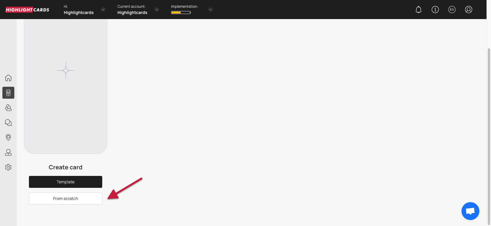
3. Here, you can either create a card using a template from a list of a wide range of pre-loaded templates or create one from scratch. To develop a better understanding, we will take a look at card creation from scratch.
4. To do so, click the button.
From Scratch
5. This initiates the cashback card creation workflow. A card is created by filling in the details in 5 sections that include Card Type, Settings, Design, Information, and Save and preview. Let us take a look at how each section works.
#### **Card Type**
1. This is the first section. Here, you make a selection regarding the type of card you want to create.
2. From the available card types, click **Cashback**.
3. Once selected, click the **Continue** button. As a result, you land on the **Settings** section.
Card Type
#### **Settings**
Here, choose the Barcode Type to determine how the card can be scanned and recognized by the system.
**Happy hours**\
A setting that allows you to select the time period during which an increased number of points will be credited to the card when a customer visits (in accordance with the specified parameters).\
❗️ Please note that this option only works for the Spend and Visit mechanics. These points have no specific expiration date.
**Card Expiration Date**\
Select the expiration date for the cashback card using the radio buttons under the Card Expiration Date heading.
Card expiration date unlimited — the card has no expiration date. The customer can use it whenever they want.\
Card expiration date Fixed term — the customer will not be able to use the card after this date. The card will stay on their phone.\
Card expiration date Fixed term after card issuing — when this option is selected, the Term dropdown appears, allowing you to choose the number of days after activation until the card expires.
**Lifetime Points**\
Set the validity of cashback points under the Lifetime points heading.\
The Fixed term after bonuses earned option works similarly and reveals the Term dropdown.
✅ Cashback points life — here, you can define the number of days a cashback point remains valid after it is earned.
Each point has its own expiration countdown starting from the date it’s earned. Every point expires individually, regardless of new points being added.
Example:\
If validity is set to 1 month and a point is earned on April 5, that point will expire on May 5.
There is no push notification about upcoming point expiration.
**Location**\
In the Locations field, enter the location(s) where you want to send geolocation push notifications.\
Customers with the card installed in Apple Wallet will receive a push when they are within 100 meters of the selected location.\
You can add multiple locations, including non-business addresses.
**Cardholder Status**\
Here, you can create multiple spending-based tiers for cashback cardholders using:
• Tier Name\
• Spend to Achieve\
• Percentage
To move to a higher tier, the customer must reach the required total spending amount — not in one purchase, but across multiple visits.
Example:\
A customer earns 1% cashback at the first tier.\
They spend 1,000 and earn 10 points.\
They spend another 1,000 and earn another 10 points. Their total spend is now 2,000.\
If the next tier requires 5,000, they need to spend 3,000 more.\
After reaching 5,000 total, they still receive 1% on that transaction, but from the *next* transaction forward, they earn 3%.
You can remove a tier using the remove button.\
Minimum number of tiers: 1\
Maximum number of tiers: 6\
Use Add Tier to create additional tiers.
**Language**\
Choose the language in which you want to create the cashback card.
**Date Format**\
Determines how the date is displayed on the card.\
If the card does not have an expiration date, this setting does not apply.
**Thousands Separator / Decimal Separator**\
This setting defines how the point balance is displayed on the customer's phone.
**Purchase amount when charging**\
The "Purchase amount when charging" setting, if turned on, requires the purchase amount to be entered whenever a transaction is processed. The entered amount will be counted in ROI statistics, in the revenue figure.\
✅ Applies only to transactions made via the scanner. If this setting is disabled, entering the amount is optional — but the window will still appear, and you can skip it.
**The Card Issuing Form**\
Here, define the fields you want to include on the cashback card. A phone number or email is required.\
You can delete fields via the shopping cart icon.
Enable the "Required" toggle to make a field mandatory.\
Enable the "Unique" toggle only for data that must be unique — usually phone numbers.
⚠️ Avoid making Name, Surname and Date of Birth unique — customers with the same name would not be able to install the card.
You can add new fields, rename fields, or use Add Field to create a new one.
**UTM tag**\
Here, create channel links for analytics tracking.\
For example, adding “Facebook” will make Highlightcards automatically generate a URL with a UTM tag.
You can create unlimited UTM links.\
You will see a unique link and QR code for each tag, and later you can check statistics showing how many customers installed the card from that source.
✅ You can also build customer segments based on UTM tags. We recommend using them from the start of your loyalty program.
**Phone Mask**\
Select the default country prefix shown in the card issuance form. Customers can change it manually if needed.
**Privacy Policy**\
If enabled, the privacy policy checkbox appears on the card installation form.\
You can edit or add privacy policy text in the field provided.
Enable Consent to the processing of personal data if you need to request explicit customer permission for data usage.
**Google Wallet Installation button**\
If enabled, this displays the Google Wallet button on the card installation form so customers can add their loyalty card to Google Wallet.
**PWA Installation button**\
If enabled, this adds the PWA (Progressive Web App) button, allowing customers to install the loyalty card as a web app without using an app store.
**Limit the number of cards issued**\
Controls how many cards can be distributed.\
0 means unlimited.
**Number of points when issuing a card**\
Sets the initial number of points the customer receives when the card is issued.
**Number of birthday points**\
On the customer’s birthday, the specified number of additional points will be added to their card.\
A push notification informs them that their balance has increased.
**Analytics**\
If you want to include a custom analytics script, add it to the Analytics field.
Once the required fields are filled, click Continue to proceed to the Design section.
#### **Design**
1. This section lets you configure the design of the cashback card.
2. Click the **Select File** button from the **Logo** heading to choose a logo to be displayed on the card and on the release form from your system storage.
Select File - Logo
3. Similarly, click the Select File button from the **Icon** heading to choose an icon from your system storage to be displayed in the push messages.
4. Choose an icon from your system storage for the center of the card by clicking the Select File button under the **Background of the central part** heading.
5. From the Colors section, you can set the colors for Card Background, Text Color, and Background color of the central part.
Colors
6. From the Fields Name heading, you can use the **Field** dropdown to select the type of field that appears on the card.
Field
7. Similarly, the Field Name field allows you to enter what text appears on the card in the defined field.
Field Name
8. In case you want the logo to appear on the Card Issuing Form, enable the Show logo at card issuing form toggle button.
9. Similarly, enable the Show background color on card issuing form toggle button in case you want the background color to appear on the card issuing form.
10. Once all the selections are made, click the **Continue** button. Resultantly, you land on the **Information** section.
#### **Information**
1. This section lets you fill relevant information in the card. The impact of each field can be viewed in the mobile screen preview displayed on the right side of the screen.
2. Use the **Card Description** field to enter a short description of the card.
Card Description
3. Use the **Company Name** field to enter the name of your business.
4. Use the **Number of points for using the card** field to define the number of points awarded to the customer on using the card.
Number of points for using the card
6. Choose whether you want to activate the referral program using the Active and Inactive radio buttons under the **Referral Program** heading.
Referral Program
8. Define when the bonus is issued to a customer from the options available under the **Get bonus at the moment when** .
9. Choose the number of points a customer earns upon sharing their card via the referral program using the **Number of points for the referrer** heading.
10. Similarly, choose the number of points a new customer earns upon registering via the referral program using the count icons under the **Number of points for a referral** field.
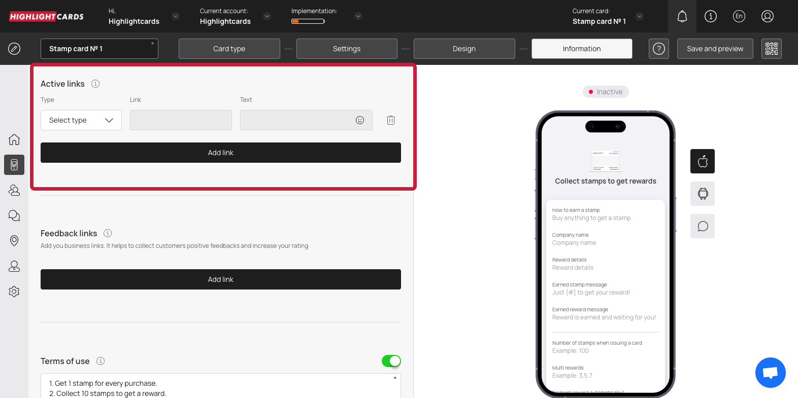
11. From the Active Links heading, choose the type of link you want to include on the card using the **Type** dropdown. The available options include URL, Phone, Email, and Address.
Type
14. Enter the website URL in the **Link** field.
15. Enter the text to appear on the card using the **Text** field.
16. To remove an active link, click the bin button.
17. To add another link, click the **Add Link** button. This adds a new row for another link to be recorded.
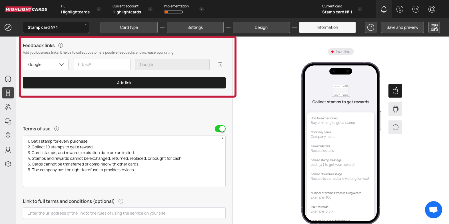
18. Similarly, use the link type dropdown and link fields under the Feedback Links heading to add your business links for the customer reviews to be recorded.
Feedback Links
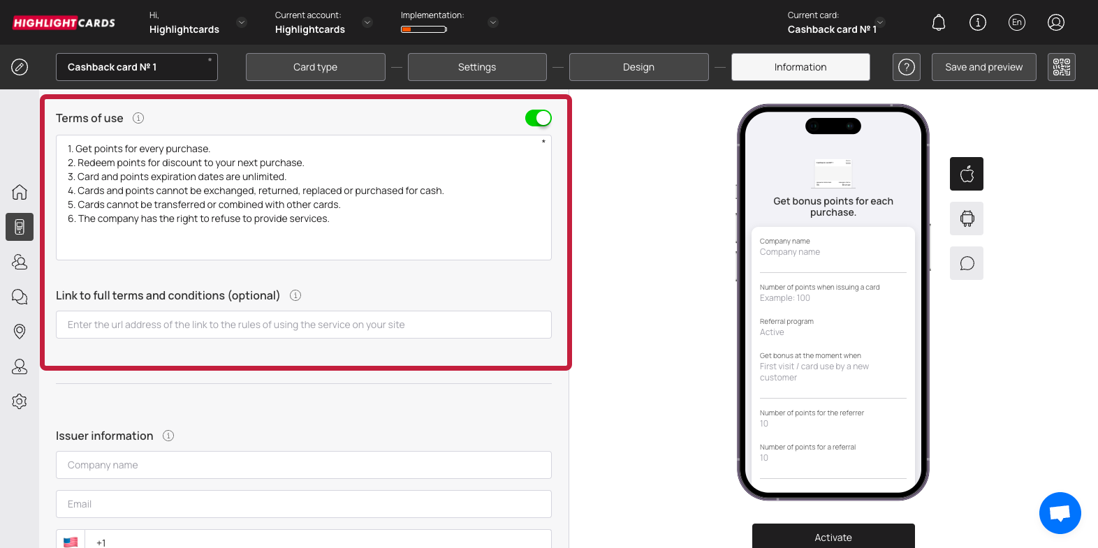
19. In case you want to include Terms of use on the card, enable the toggle button next to Terms of Use heading.
Toggle
20. Enter any terms of use you want to include on the card using the Terms of Use field.
21. Use the Link to full terms and conditions field to provide a link to the complete T\&Cs of your business.
22. Use the Company Name, Email, and Contact Number fields under the Issuer Information heading to record the card issuer details to be displayed at the back of the card.
23. To activate the template, click the **Activate** button under the card preview.
Activate
**Save & Preview**
1. As the Finish button is clicked, the Preview popup is displayed.
2. From here, you can scan the QR code of the card.
3. To copy the link of the car, click the **Copy link** button.
 icon. Doing so opens the Cards module.
 button.


.png?alt=media&token=4bd226df-feb7-48b3-9966-809f4cf6c253)